-
Architects: Urban Office
- Area: 10000 ft²
- Year: 2017
-
Photographs:Arthur Tintu
-
Manufacturers: Alumil, Armstrong Ceilings, RIGIPS

Text description provided by the architects. This project came to us very late when it was in execution. The beneficiary wanted to change the image of the building. We had to take over the entire project coordination and develop a project very quickly.

Thanks to the already formed teams and the experience we have we succeeded in changing the project from the foundations and bringing it into the 21st century. We chose to support the vertical accents of the building and to balance the horizontal dynamics. In this sense, parasols - masks were introduced to hide areas that seemed to be badly articulated or redundant.

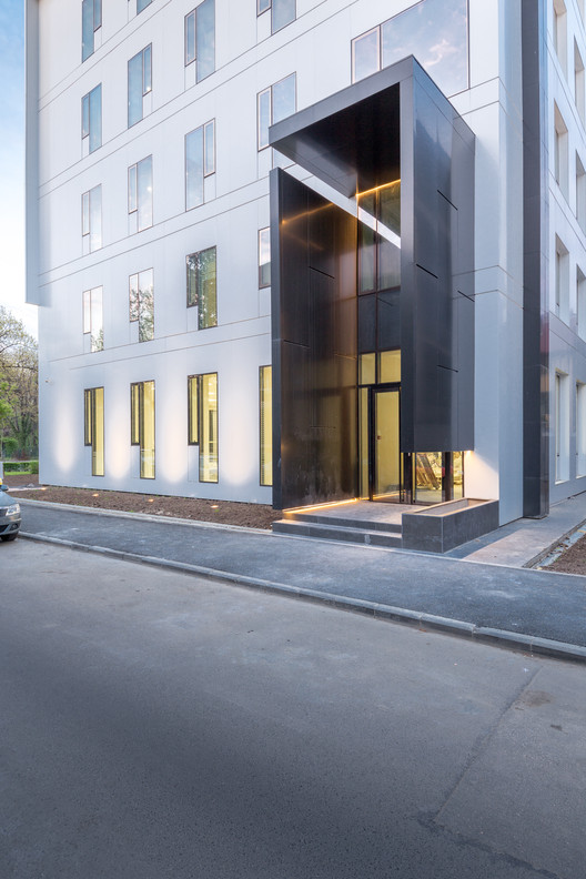
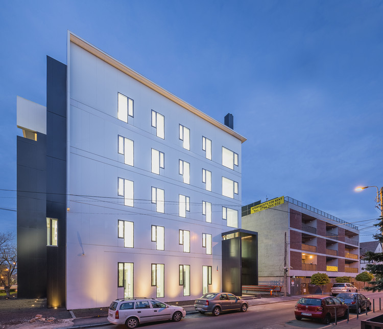
The palette was separated in two colors - black and white, we removed the curtain walls and we focused on the simple rectagular windows....those in turn have received intrusions and differentiated frames, details and subtle visible accents.

We diveded the building in several parts ... for natural reasons - it was too fat. After all the angles and perspectives have been analyzed, we gradually began to look for details and effects that will harmonize and interconect with each other.

We had the opportunity to work in 2004 at the Alexandrina street no.36, so for us it was a rare occasion to work and correct a space according to our evolution over time. From this point of view it was a real pleasure to resume the design theme. It's actually a street corner where We've been involved in two decades.

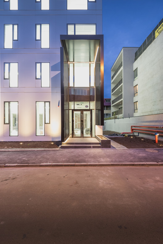
The building has received new and contemporary forms, but careful attention has been paid to urban details, so in the Porumbaru street the building has to be connected by a jump from GF + 1 to GF + 5. This we speculated and created a dynamic facade with a generous entrance highlighted by a yellow and porous cantilever.

In Alexandrina street we did differently, the four storey building led us to a less abrasive approach, the facade is quiet and flat, and the entrance on two levels is meant to make the transition to the neighboring building.

For the Prezan Avenue there was a more angular way, so parts of the building can only be seen from a distance because from the angular perspective they are blocked by elements of the building – parasols and building corners. Artificial lighting undergoes geometric shapes and function - so at night, wide cantilevered canopy can easily be read making the building noticeable for 24 hours.

We were heavily influenced by post-war buildings with large canopies that offerred urban hats to the city, such buildings are also in the area and part of urban fabric and silhouette of the city, we took this element and interpreted it in our own style. After all, we consider it an exquisite exercise of urban built space (since the project was already under construction).


